常见案例
... 2022-2-18 About 1 min
# 常见案例
# 玻璃磨砂效果
- 玻璃磨砂效果主要是用到了 blur()滤镜做出模糊元素的效果
- 通过给元素加伪类相同的背景来产生视觉误差来做到此效果
- 不说废话直接上
查看演示代码
<!doctype html>
<html lang="en">
<head>
<meta charset="UTF-8" />
<title>Document</title>
<style type="text/css">
* {
margin: 0px;
padding: 0px;
}
html,
body {
font-size: 19px;
font-family: 'Verdana', 'Arial';
color: rgba(0, 0, 0, 0.8);
}
.main {
margin: 10px auto;
width: 800px;
height: 400px;
position: relative;
background: url(img.jpg) left top;
background-size: 800px 400px;
}
.content {
/* 是否显示上层的磨砂 */
/* display: none; */
width: 800px;
height: 400px;
position: absolute;
top: 50%;
color: #fff;
left: 50%;
overflow: hidden;
margin-top: -200px;
margin-left: -400px;
border-radius: 10px;
box-shadow: 0 10px 20px rgba(0, 0, 0, 0.5);
z-index: 100;
padding: 50px;
opacity: .7;/* 控制文字的显示不透明度 */
box-sizing: border-box;
/*不会把盒子撑开*/
}
.content::before {
content: "";
position: absolute;
top: 0px;
left: 0px;
right: 0px;
bottom: 0px;
z-index: -1; /* 注意x-index的使用 */
/*-1 可以当背景*/
-webkit-filter: blur(20px);
filter: blur(20px);
margin: -30px; /*消除边缘透明*/
background: url(img.jpg) left top;/* 通过改变宽高改变下层的模糊度 */
background-size: 1030px 460px;
/*平铺*/
background-attachment: fixed;
/*位置固定*/
}
.content h1 {
text-align: center;
margin-bottom: 20px;
}
.content p {
line-height: 1.7;
/*1.7倍行间距*/
}
.container{
width: 800px;
height: 400px;
text-align: center;
line-height: 400px;
color: #fff;
}
</style>
</head>
<body>
<div class="main">
<div class="container">测试文字:爱好广泛拉萨的结果返回安科技和</div>
<div class="content">
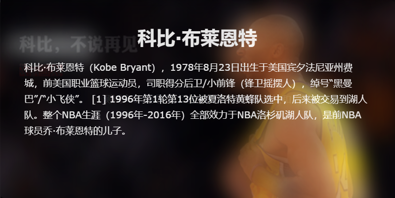
<h1>科比·布莱恩特</h1>
<p>科比·布莱恩特(Kobe Bryant),1978年8月23日出生于美国宾夕法尼亚州费城,前美国职业篮球运动员,司职得分后卫/小前锋(锋卫摇摆人),绰号“黑曼巴”/“小飞侠”。 [1] 1996年第1轮第13位被夏洛特黄蜂队选中,后来被交易到湖人队。整个NBA生涯(1996年-2016年)全部效力于NBA洛杉矶湖人队,是前NBA球员乔·布莱恩特的儿子。</p>
</div>
</div>
</body>
</html>1
2
3
4
5
6
7
8
9
10
11
12
13
14
15
16
17
18
19
20
21
22
23
24
25
26
27
28
29
30
31
32
33
34
35
36
37
38
39
40
41
42
43
44
45
46
47
48
49
50
51
52
53
54
55
56
57
58
59
60
61
62
63
64
65
66
67
68
69
70
71
72
73
74
75
76
77
78
79
80
81
82
83
84
85
86
87
88
89
90
91
92
93
94
95
96
97
98
2
3
4
5
6
7
8
9
10
11
12
13
14
15
16
17
18
19
20
21
22
23
24
25
26
27
28
29
30
31
32
33
34
35
36
37
38
39
40
41
42
43
44
45
46
47
48
49
50
51
52
53
54
55
56
57
58
59
60
61
62
63
64
65
66
67
68
69
70
71
72
73
74
75
76
77
78
79
80
81
82
83
84
85
86
87
88
89
90
91
92
93
94
95
96
97
98
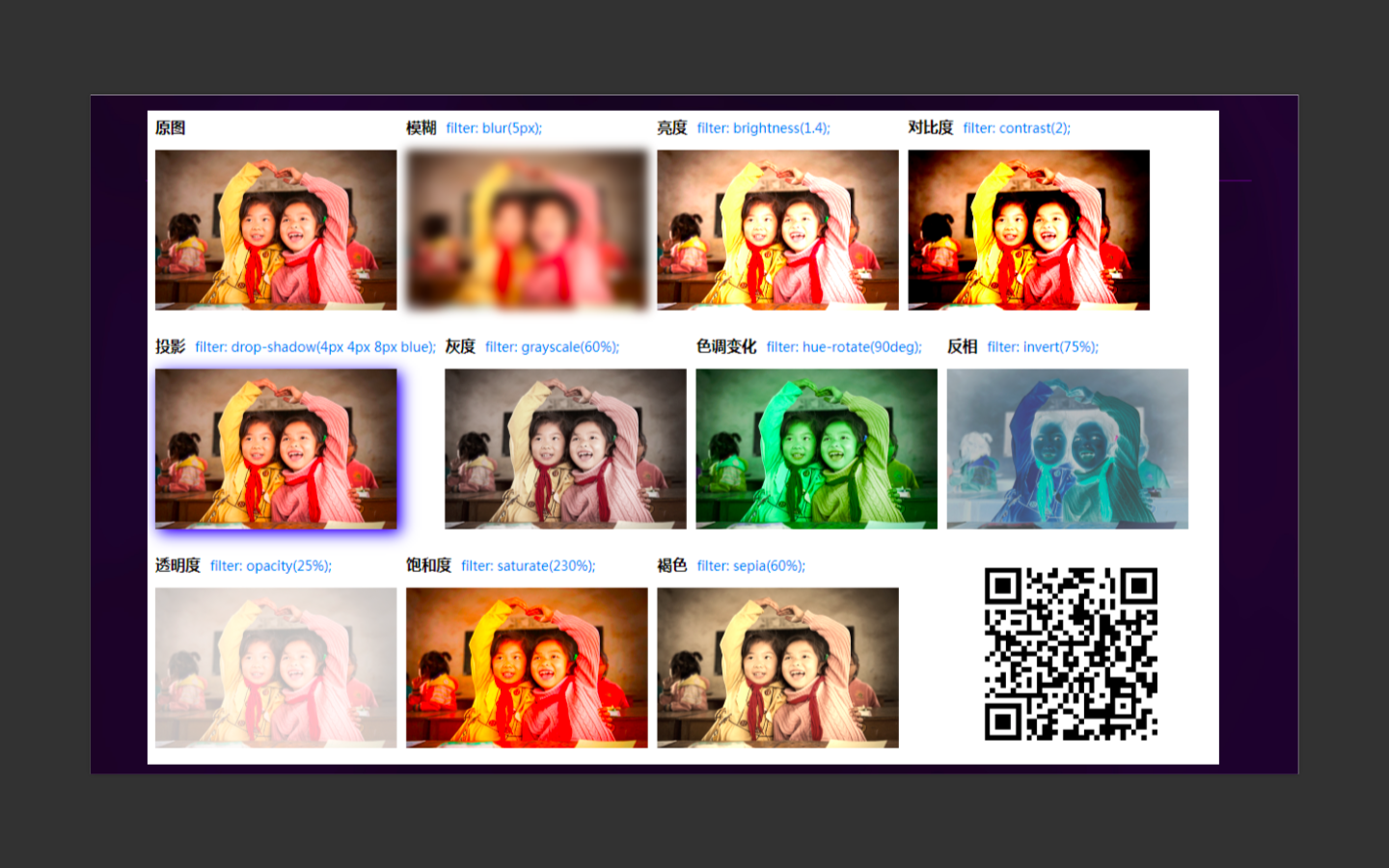
# 关于 filter 的还有一些其他的常用属性

# 具体的简单效果
# 完成一个输入框的效果
# 伪类中的content
<div class="test-after" data-content="test"></div>
1
.test-after{
  position:relative;
  &::after{
    content:attr(data-content);
    position:absolute;
    top:0;
    left:0;
  }
}
1
2
3
4
5
6
7
8
9
2
3
4
5
6
7
8
9
# 实现1像素的问题 (伪类+transform)
.scale-1px{
  position: relative;
  border:none;
}
.scale-1px:after{
  content: '';
  position: absolute;
  bottom: 0;
  background: #000;
  width: 100%;
  height: 1px;
  -webkit-transform: scaleY(0.5);
  transform: scaleY(0.5);
  -webkit-transform-origin: 0 0;
  transform-origin: 0 0;
}
1
2
3
4
5
6
7
8
9
10
11
12
13
14
15
16
2
3
4
5
6
7
8
9
10
11
12
13
14
15
16
.scale-1px{
  position: relative;
  margin-bottom: 20px;
  border:none;
}
.scale-1px:after{
  content: '';
  position: absolute;
  top: 0;
  left: 0;
  border: 1px solid #000;
  -webkit-box-sizing: border-box;
  box-sizing: border-box;
  width: 200%;
  height: 200%;
  -webkit-transform: scale(0.5);
  transform: scale(0.5);
  -webkit-transform-origin: left top;
  transform-origin: left top;
}
1
2
3
4
5
6
7
8
9
10
11
12
13
14
15
16
17
18
19
20
2
3
4
5
6
7
8
9
10
11
12
13
14
15
16
17
18
19
20
# 单(多行)行文本溢出
查看演示代码
/* 单行文本 */
.method1 {
    text-overflow: ellipsis;
    white-space: nowrap;
}
/* 兼容性 */
.method2 {
    position: relative;
    line-height: 20px;
    height: 20px;
    width: 180px;
    padding-right: 20px;
}
.method2::after {
    content: '...';
    position: absolute;
    width: 20px;
    background: #fff;
    top: 0;
    right: 0px;
}
/* 多行文本 */
.mult_line_method1 {
    overflow: hidden;
    text-overflow: ellipsis;
    display: -webkit-box;
    -webkit-line-clamp: 3;
    -webkit-box-orient: vertical;
    width: 200px;
}
/* 兼容性 */
.mult_line_method2 {
    position: relative;
    line-height: 20px;
    height: 60px;
    width: 200px;
    overflow: hidden;
}
.mult_line_method2::after {
    content: "...";
    position: absolute;
    bottom: 0;
    right: 0;
    width: 24px;
    background: #fff;
}
1
2
3
4
5
6
7
8
9
10
11
12
13
14
15
16
17
18
19
20
21
22
23
24
25
26
27
28
29
30
31
32
33
34
35
36
37
38
39
40
41
42
43
44
45
2
3
4
5
6
7
8
9
10
11
12
13
14
15
16
17
18
19
20
21
22
23
24
25
26
27
28
29
30
31
32
33
34
35
36
37
38
39
40
41
42
43
44
45
# 四周阴影
qureySelect{
 box-shadow: #808080 0px 0px 10px;
}
1
2
3
2
3
# 滚动条颜色
@primary-color: #449eff;
.changeScrollStyle() {
  &::-webkit-scrollbar {
    width: 4px;
    height: 4px;
    border-radius: 4px;
    transition: 0.3s background;
  }

  &::-webkit-scrollbar-thumb {
    background: none;
  }

  &:hover::-webkit-scrollbar-thumb {
    background: @primary-color;
  }
}
1
2
3
4
5
6
7
8
9
10
11
12
13
14
15
16
17
2
3
4
5
6
7
8
9
10
11
12
13
14
15
16
17